
Introduction
Spring is a time of renewal, a season that breathes fresh life into our surroundings after the cold grip of winter. As flowers bloom and the days grow warmer, many of us feel an innate desire to refresh our homes, cultivating spaces that reflect the vibrancy and optimism of the season. One of the most effective ways to achieve this rejuvenation is through the use of pastel colors in your home interiors. Pastels are not just visually appealing; they evoke feelings of serenity and lightness, making them versatile choices for any room.
Pastel colors, with their soft and gentle hues, can transform a dull space into a tranquil haven. They have a unique ability to harmonize with various design styles, whether your preference leans towards modern minimalism or bohemian eclecticism. In this article, we will explore chic pastel color combinations that can breathe new life into your home this spring. So, grab a cup of tea, and let’s dive into the world of pastels!
“Creating a cozy reading nook is all about maximizing comfort in a small space. It’s about intentional design that serves both function and feeling.”
– Interior Design Magazine
Understanding Pastel Colors
Pastel colors are defined as soft, muted shades that have a low saturation level. They typically include hues like baby blue, soft pink, lavender, mint green, and pale yellow. Characterized by their lightness, pastels tend to be calming and inviting, making them perfect for creating cozy spaces. Psychologically, pastel colors are known to evoke feelings of calmness and optimism. They can reduce anxiety and promote a sense of peace, which is especially beneficial in our fast-paced lives.
Historically, pastel shades have seen various trends in home decor. They gained popularity in the 18th century, particularly in France, where they were used to create light and airy interiors. In recent years, pastels have made a grand comeback, often featured in contemporary designs as a way to soften spaces and add a touch of whimsy.
The versatility of pastels cannot be overstated. They can complement a myriad of design styles, seamlessly fitting into modern, traditional, or even bohemian aesthetics. For instance, a modern space can benefit from pastel accents that create contrast against darker tones, while a traditional setting can embrace pastels to enhance its vintage charm. This adaptability makes pastels an excellent choice for any homeowner looking to refresh their space.
Choosing the Right Pastel Palette for Your Space
When it comes to selecting a pastel palette for your home, understanding how light interacts with colors is essential. Natural light can dramatically alter the appearance of pastel shades, making them appear brighter or softer depending on the time of day. For instance, a room flooded with sunlight may enhance the vibrancy of a pastel yellow, while a dimly lit room could make it feel more muted and subdued.
Additionally, consider the size of the room when choosing your pastel palette. Larger spaces can handle bolder combinations, while smaller rooms may benefit from lighter, more delicate shades to create an illusion of spaciousness. A pastel color scheme can be cohesive when you understand the basics of the color wheel. Colors that are adjacent to each other (analogous colors) work harmoniously, while complementary colors can add a striking contrast.
Before committing to a color scheme, it’s wise to use color samples. Paint swatches can help you visualize how different combinations will look in your space, allowing you to make informed decisions. This step can save you time and money, ensuring that you love the colors you choose.
Chic Pastel Color Combinations for Living Rooms
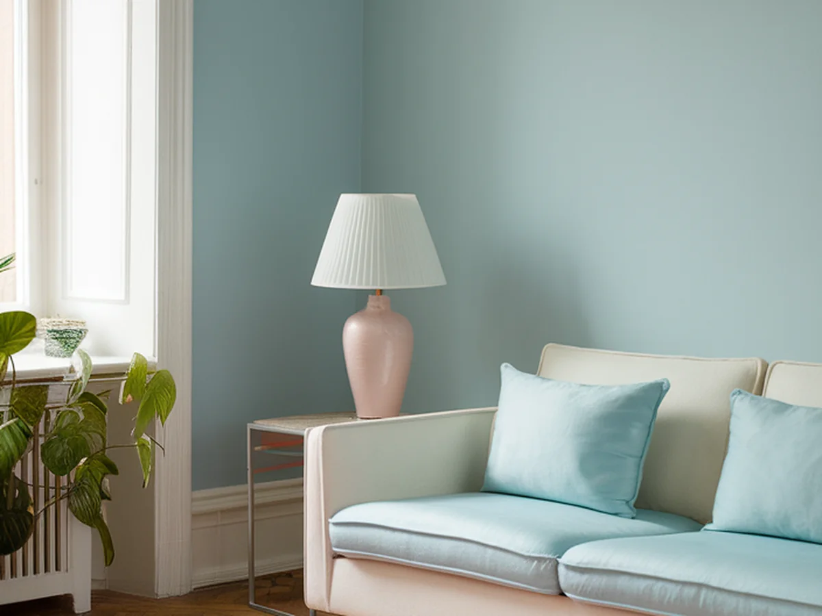
In the living room, creating an inviting atmosphere is paramount. One popular pastel combination is mint green and soft pink. These colors work beautifully together, with mint green bringing a fresh vibe and soft pink adding a touch of warmth. You can incorporate these hues through accent walls, furniture, or decorative elements like cushions and throws.
Pastel accents in furniture can also elevate the aesthetic of your living room. Consider a soft pink sofa paired with mint green armchairs, or vice versa. Neutral tones, such as beige or soft gray, can help balance these vibrant pastels, allowing them to shine without overwhelming the space.
Patterns are another excellent way to incorporate pastels. Think cushions with floral designs featuring mint and pink, or a stylish rug that ties the colors together. This layering of textures and patterns can create a chic and cohesive look.
Table: Popular Pastel Combinations for Living Rooms
| Combination | Accent Ideas | Neutral Pairings |
|---|---|---|
| Mint Green & Soft Pink | Cushions, Throws, Artworks | Beige, Soft Gray |
| Lavender & Pale Yellow | Rugs, Vases, Wall Art | White, Cream |
| Baby Blue & Peach | Tableware, Curtains, Throw Pillows | Light Brown, Light Gray |
Pastel Inspirations for Bedrooms
For bedrooms, a soothing ambiance is crucial for relaxation and rest. Combinations like lavender and baby blue are perfect for creating a serene atmosphere. Lavender evokes feelings of calmness, while baby blue can create a tranquil environment conducive to sleep.
When choosing bedding and wall colors, opt for soft, pastel shades that complement each other. A lavender wall paired with baby blue bedding can be a delightful combination. Pastel lighting is equally important; consider using soft yellow or pink lampshades to create a warm glow in the evening.
To enhance your bedroom further, incorporate pastel art and accessories. Framed prints with soft colors can tie the room together, while pastel-colored curtains can filter light beautifully. The key is to create a harmonious space that invites relaxation.
Revamping Kitchens with Pastel Hues
Kitchens can also benefit from the cheerful energy of pastels. Consider combinations such as pale yellow and soft aqua for a bright and inviting space. These hues can be integrated into cabinetry, backsplashes, and even countertops for a fresh look.
Pastel-colored kitchenware is an easy way to update your kitchen without committing to a full renovation. Think about adding pastel dishes, cookware, or even small appliances like a toaster or blender. These small changes can have a significant impact on your kitchen’s overall aesthetic.
If you’re feeling adventurous, consider pastel appliances. Brands are increasingly offering options in softer shades, allowing you to make a bold statement without overwhelming your kitchen. This can create a chic focal point that combines function with style.
Table: Pastel Combinations for Kitchens
| Combination | Incorporation Ideas | Accent Elements |
|---|---|---|
| Pale Yellow & Soft Aqua | Cabinetry, Backsplash | Kitchenware, Dish Towels |
| Mint Green & Cream | Countertops, Wall Colors | Bar Stools, Utensils |
| Coral & Light Gray | Appliances, Rugs | Plates, Wall Clocks |
Creating a Playful Atmosphere in Kids’ Spaces
In children’s spaces, the right color combinations can create a playful and imaginative atmosphere. Vibrant combinations like coral and turquoise are perfect for playrooms, encouraging creativity and fun. These colors can stimulate a child’s imagination while maintaining a sense of warmth and comfort.
When selecting furniture for kids, durability is key. Look for pastel-colored furniture that can withstand the wear and tear of active play. Additionally, consider DIY projects that incorporate pastels, such as creating colorful wall decals or art pieces that your child can help design.
Pastel toys and storage solutions can also contribute to the overall theme. Consider using pastel bins or baskets for organization; they not only keep the space tidy but also add a touch of style. This way, you create an organized, playful environment that inspires creativity.
Incorporating Pastels in Outdoor Spaces
Pastels aren’t just for indoor spaces; they can brighten up your outdoor areas too! Combinations like peach and seafoam are ideal for patios and gardens, bringing a sense of calm and relaxation to your outdoor living space. These soft hues can be used in outdoor furniture and decor, creating a welcoming atmosphere for guests.
Consider pastel outdoor furniture that complements your garden’s natural beauty. Cushions, umbrellas, and even planters in pastel shades can enhance the aesthetic of your outdoor area. Additionally, incorporating pastel flowers in planters or flower beds can create a cohesive outdoor theme that ties everything together.
Creating a cohesive outdoor theme is essential for a well-curated space. Ensure that your pastel elements harmonize with the surrounding greenery, allowing your garden to flourish alongside your decor.
Accessorizing with Pastel Colors
Accessorizing is a simple yet effective way to incorporate pastel colors into your existing decor. Start by adding pastel accessories like cushions, curtains, and rugs to enhance your current color scheme. These items can make a significant impact, providing a quick refresh without needing a complete overhaul.
Seasonal decor swaps can also keep your spaces feeling fresh and inviting. Consider changing pastel cushions or throws with the seasons to match the mood and vibe of your home. Additionally, pastel artwork and wall decor can enhance the charm of various rooms, adding a personal touch to your space.
Lastly, mixing textures is crucial for achieving a chic look. Combine soft pastel fabrics with harder materials like wood or metal to create balance and visual interest in your decor. This interplay of textures can elevate your space, making it feel more dynamic and inviting.
Conclusion
Revitalizing your home with pastel colors this spring can be a transformative experience. The calming, uplifting nature of pastels can breathe new life into your spaces, reflecting the beauty and freshness of the season. Whether you choose to go bold with vibrant combinations or stick to softer hues, experimenting with pastels allows you to express your personal style while creating serene environments.
As you embark on your pastel journey, remember to have fun with your choices and incorporate colors that resonate with you. We’d love to hear about your pastel decor ideas and experiences. So, grab your paintbrushes and start planning your spring home makeover today!
Frequently Asked Questions
What are pastel colors?
Pastel colors are soft, muted shades that typically have low saturation. They include hues like baby blue, lavender, mint green, and pale yellow. Pastels are known for their calming qualities and versatility in various design styles, making them a popular choice for home decor.
How can I choose the right pastel palette for my room?
To choose the right pastel palette, consider the room’s size and how natural light affects the colors. Lighter pastels work well in smaller spaces, while larger rooms can accommodate bolder combinations. Use color samples to visualize how different shades interact in your space before making a final decision.
What are some popular pastel combinations for living rooms?
Popular pastel combinations for living rooms include mint green paired with soft pink, lavender with pale yellow, and baby blue mixed with coral. These combinations can be incorporated through furniture, decor, and accent pieces to create a cohesive and inviting atmosphere.
Can pastels be used in outdoor spaces?
Yes, pastels can be beautifully used in outdoor spaces. Combinations like peach and seafoam can create a serene patio or garden atmosphere. Consider using pastel outdoor furniture, decor, and planters to enhance your outdoor environment and create a cohesive theme.
How can I incorporate pastels without a complete renovation?
You can incorporate pastels without a complete renovation by adding pastel accessories such as cushions, curtains, and rugs. Seasonal decor swaps and mixing pastel items with existing decor can refresh your space. Pastel artwork and decorative items can also enhance your home’s aesthetic while keeping costs low.